Tuesday 29 December 2015

OUGD502 Taking Care of Business - Collateral (Study Task One)

To try out our colour scheme and logo design myself, I decided that I would create a letterhead. This can be seen below. I think it's very effective as it is coherent with the other designs so far, and it is also bold and would stand out on the recipients desk. The back of the letter can also be seen below. This would be pricey to print, however I think it would be worth it as it would also double up as a poster design, and therefore is self promotion for our studio.


I also decided to design a business card for myself that would be sent with the letter. This follows the same rules; the colour scheme, typeface and header font. I think it's simple but successful, and it would be cheap to reproduce in bulk.


Sunday 27 December 2015

OUGD502 Taking Care of Business - Website Development (Study Task One)

Originally, I had a quick go at designing a website flat. I designed this before we had come up with a colour scheme and before we had assigned the role of web designer to James. Personally, I think the website I designed is very simple, although really successful as it showcases our portfolio really successfully. If it were to be used, it would need to be changed to add the colour scheme, however it won't be as I'm not great at designing websites and I don't need to anymore - it would be unnecessary work.


We gave the task of developing a web design to James, as it is something he is passionate about and I personally really dislike designing website flats. The website James designed is very relevant as it follows the colour scheme that we have assigned to our business. It also uses the typeface Bluu Next and Apercu, which we will use on our presentations sides, so is therefore fluent in that aspect too.

Thursday 24 December 2015

OUGD502 Taking Care of Business - Colour Scheme (Study Task One)

We found a magazine called 'Tunica', for which we instantly fell in love with the colour scheme. We thought we would use the same colour scheme for our studio as a whole, and also include the obscure shapes. Below is our colour scheme.


We think our colour scheme would work really effectively, as we have chosen five colours that work really well together, and each of them represents each member. On top of this, we would also use the colour black, however. The colour scheme will be used on the website design and general collateral that we are going to create for our business.


Monday 21 December 2015

OUGD502 Creative Report - Studio DBD, Manchester (Studio Brief One)

Studio DBD is a design studio based in Manchester. Their work is often very bold and uses contasting colours that make the posters stand out on a wall. I like the studio as they don't have one specific style that they stick to, they use a lot of different styles of design, which can be seen below in the two images. The studio specialises in identity, print design, web design and typography and was set up by the graphic designer Dave Sedgwick. This man would be a really interesting person to interview for this project, as the studios work is very interesting and colourful. 


Friday 18 December 2015

OUGD502 Taking Care of Business - Similar Design Studios (Study Task One)

Rabbit Hole Agency

Rabbit Hole Agency is a design studio based in Leeds. It's quite similar to our business, in the way that their designs are very obscure and stand out from the crowd - something we would hope from our own designs. This design studio is also a multidisciplinary, similar to our own. In the past, they have had a lot of clients, including Coldplay, Deadmau5 and Lost Village Festival. Their logo design is very obscure, however very successful and pleasing to look at.


HORT

HORT is a design studio based in Berlin. Their design work is, similar to Rabbit Agency, very obscure and their website is very difficult to navigate, however fits perfectly with their aesthetic. Their logo type stands out, which is something that we wanted our own to do.


Print Club London

Print Club London was established in 2007. It is run by two members: Fred Higginson and Kate Higginson. This studio is similar to our own studio as it specialises in screen prints. Although our studio won't specialise solely in this, I believe it gives us quite a good edge as there aren't any studios in leeds that will have the screen printing equipment, and therefore we would have the edge as we wouldn't have to outsource all of our prints - meaning it would be cheaper for the client, and the client would also have full control of what would happen to the prints.


Thursday 17 December 2015

OUGD502 Taking Care of Business - The letter 'e' (Study Task One)

As the letter 'e's in Screeeeen represent each member as an individual, we wanted to somehow get this across within a design. We decided that each of us would go away and create their own design within the letterform. We would them put them all together. Depending on if it's successful, we could potentially use this as the logo. Below are the letter 'e's that I created. My preferable colourscheme is the one with red and blue, as I think it's really bold and expressive, but also simplistic so reiterates the fact that I enjoy doing branding and identity - as logo design is mainly successful if it's simple and easily recognisable.


OUGD502 Design Strategy Presentation - Briefing (Studio Brief Two)

Produce and present a 7-10 minute presentation that communicates a reflective summary of your experiences on the course to date. You should reflect upon who you are as a learner and a designer, as well as how the things you have experienced over the past two years have affected your current aims and ambitions. You should also identify creative concerns, personal and professional ambitions that you intend to explore further over the Summer and during Level 6 of the programme.

The presentation should also review your personal and revised self-branding. Then continuing from your logo and identity as created in Level 4 you must have assessed, evaluated, adapted and further developed your own brand as a designer and you should also look to apply this in ways that you feel are most appropriate. These could include:

Your visual identity - your own professional visual identity for 'Brand You' that, if appropriate to your practice, could be distributed via an appropriate range of stationary and promotional material. For this element, you should aim to create a simple but effective identity that communicates the essence of your creative image and details about your emerging design practice. You will need to consider the practicalities of your identity which may include a logo or bespoke typeface. How readable, legible and usable is your identity?

Your promotion pack - a promotion package that communicates your skills, abilities, creative concerns and professional competencies to appropriate sectors of the creative and cultural industries. This pack could include a business card, introductory information, samples of work, a creative CV, contact details and other relevant material and information.

Your website - you may propose/produce the structure and content of your own personal website. Keep it simple and make sure that your visual identity forms the basis of your online brand.

Ensure that the redevelopment of your branding plus any design outputs featuring the deployment of your identity is documented on your PPP blog.

Saturday 12 December 2015

OUGD502 Taking Care of Business - Logo Development (Study Task One)

We found a typeface called 'Bluu Next' which we all thought really represented us as designers. The typeface is quite geometrical, however legible and slick, and very different from my go to typefaces, which are usually Helvetica, Apercu or Futura. This typeface only works as a title font, however it's really successful and in the end we decided to use this for our main logo.


Before we decided to just use the type as a logo, however, I had begun designing some logo ideas. These can be seen below. As the typeface is geometrical, Cameron had the idea of using a very simple logo design with the typeface - a simple outline of a square. I think this was very successful and could definitely be used as bullet points on the website.

I then got rid of the 'e's. I did this because the e's make up the business and basically are the most important part of the business as they represent us as individuals. I thought by getting rid of the letters, it might symbolise to the client the importance of each of us, and how they need us to work with them to be complete.


I tried to design the letter 'e' to represent us quite obscurely within a black out box. I thought this was successful as it isn't too obvious that it's the letter 'e' and is quite obscure yet successful, similar to our method of design.


I then tried a simple outline of a box. This was unsuccessful as it's too simplistic and doesn't portray any kind of message in my opinion.


I really liked the idea of getting rid of the 'e's, and tried it a different way. This way, you know that the 'e's are supposed to be there, and I think it's a lot more legible to read as the mind puts in the 'e's without thinking. 

Finally, I decided to use a shadow effect on the word 'screen'. I thought this was effective as it symbolises the fact that we work on both digital and analogue screens. I think it also symbolises the screen printing process as a whole - as it looks like how a screen looks when the print has been altered slightly below the screen.


All of my designs, however, are void as we decided the best thing to do would to just use the word screeeeen as a logo. This can be seen below. I think it's the most effective design as it's simple, and I don't think our logo design needs to be complex as we are not complex people, we just have a passion for what we do - it's straight to the point, recognisable and legible.


Friday 11 December 2015

OUGD502 Taking Care of Business - Manifesto (Study Task One)

Myself and Izzie were looking at how we could create an interesting manifesto that would stand out and be memorable from other design studios. We were looking online at Snask's website, on which their manifesto is written as 10 commandments. We thought this was really interesting and quirky, and decided to come up with something similar for our own business - The Seven Deadly Sins.


I really wanted to use an element of comedy, so originally, myself and Cameron came up with the seven deadly sins below:

Lust: I haven't spoken to a real person in more than three days.
Gluttony: I put kale in every meal I make.
Greed: I'll have a quadruple shot venti cappuccino with soy milk and a cube of ice, heavy on the foam.
Sloth: Netflix and Baskerville.
Wrath: Overly twee designs.
Envy: I really like that typeface, what is it?
Pride: Posting work on every social network possible.

Cameron edited this for the website, however, as he wanted it to be more serious, which I understand, however I did really like the ones that we came up with collaboratively. 

OUGD502 Taking Care of Business - Why We're Different (Study Task One)

Before we write our manifesto, we all wanted to discuss why we think we're different and stand out from other studios both locally and globally. We think that we would stand out from the competition as we like to think of our business as a complete package - we would help the client from start to finish, including print, whether that is screen printing or digitally printing. We also think we stand out as we would offer so many different services, something I will discuss later on my blog when I have made a complete list.

We like to think of our business as having no competition, as we would love to work collaboratively with other design studios - we would prefer to make friends not foes.

Thursday 10 December 2015

OUGD502 Creative Report - One Day Brief: I LOVE HORT (Study Task 2)

The Brief.

Today we have been set a one day brief to create a gift for the design studio HORT based in Berlin. HORT is a design studio launched in 1994. It initially developed a reputation for its music industry-based design projects, however since then, it has demonstrated both versatility and an approach to experimentation through the juggling of big client work, such as Nike, Volkswagen and The New York Times.

The brief for today is to produce a piece of work exclusively for Hort. This design will be sent to Germany to inform and excite Horts founder ahead of the LCABAGD Trip to Berlin. 

What will you make? Do some research. Develop a concept. Have some fun. Your work can be produced using any medium or technique. Both digital and physical outputs can be devised but you are asked to ensure that each offering is submitted as a 300dpi image. These digital files will be collected at the end of the day. It is also suggested that you should blog this day's work to make full use of any potential exposure.

Possible Ideas.

Before jumping right into designing the gift for HORT, I decided it would be a good idea to make a mind map of some possible ideas. Obviously as this is a one day brief, this will be pretty vague. My response will be an obvious response to each concept, however, as there isn't enough time to have a bigger, deeper, less obvious concept. 


I have decided to focus my brief on blue whales becoming extinct. It will be a very simple gif - but it won't say hello, like suggested by the brief. Instead, it will focus on the whale not saying hello, meaning that they are disappearing. Now I am going to research some designs based around extinction to see what has already been created about the subject. 

Research.

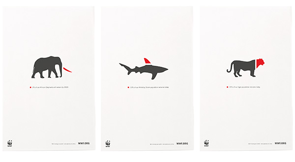
Firstly, I decided to look into WWF posters, as I have followed a lot of their campaigns about animal extinction, and their designers are incredibly talented at getting a point across, without being too graphic with imagery to scare people. I particularly think the next two images are really successful, as they explain simply why the animals are becoming more endangered and how terrifying the prospect of that is. 


I follow an online website called The Dodo, which is an organisation fighting against animal cruelty. This particular website is really successful, as it uses its Facebook page to its advantage - it will post quite heart-wrenching videos of animal cruelty, but it will also post happy stories about animals being rescued. I really like the name of this company and the icon logo, although I'm not particularly a fan of the typeface used. 


I watched a documentary a couple of years ago entitled Blackfish. This documentary was such a success as it exposes the mistreated animals in SeaWorld in the USA. The campaign for this documentary was huge, and people still talk about it to this day. There has also been progress in the court case against SeaWorld - something that this documentary definitely helped with. I think the fact that the documentary was a moving image definitely helped, as it was on Netflix and pretty much accessible to everyone with the internet. For this reason, I think I would like to make a gif for HORT.


I decided this would be easiest to achieve my paper cutting. This is because I have never created an animation before, and for a one day brief it's probably not the best idea to try to learn a completely new skill. I got to work on my paper cutting, and then took single images, moving each piece of stock each frame. This was actually quite tedious, however I think the images have come out very successfully. These can be seen below. There was 28 images to put together into a gif and edit.


As I have made gifs before, this was quite an easy process. Here is the final gif. I think it's very successful and it gets the message across that I was trying to about extinction, without being graphic.


Tuesday 8 December 2015

OUGD502 Design Strategy Presentation - INFLUX Exhibition (Studio Brief Two)

I went to an exhibition called InFLUX that was a showcase of work that third year students at Leeds Beckett have created during their first semester. I decided to go to this exhibition as I wanted to see what kind of work the course has been producing, and I wanted to check out the competition. It was a really interesting exhibition and there was a wide range of work, as the course is graphic arts and illustration. There wasn't a theme to the exhibition, all of the work was very different. I particularly enjoyed the moving graphics that a student had created, and I also liked a poster that was created using stickers, as it was very bold and colourful. 


Friday 4 December 2015

OUGD502 Taking Care of Business - Type of Business (Study Task One)

We each decided to read up into the different types of businesses and decide which we think would be most appropriate for our own business.

A Partnership.

A partnership business is when each business partner shares responsibility personally for the business. Each partner would pay tax on their own share of the profits.

The nominated partner would have to sent a partnership Self Assessment tax return every year. All partners must send a personal Self Assessment tax return every year, pay income tax on their share of the partnership's profits and also pay national insurance tax. The partnership would have to register for VAT if it is expected that the business would be taking more than 82,000 a year.

A Limited Company.

A limited company is an organisation that is responsible in its own right for everything it does and its finances are separate to the members personal finances. Any profit it makes is owned by the company after it pays corporation tax. The company can then share its profits. Directors are responsible for running the company - they often own shares, but don't have to.

A Co-Operative.

A co-operative business is a member-owned business structure with at least five members, all of whom have equal voting rights regardless of their level of involvement or investment. All members are expected to help run the business.


As a group, we decided that it would be most beneficial for every member if the business would be a limited company. We chose this as it has a safety net, as if the business (God forbid) were to fail, then at least our own personal finances wouldn't be caught up and lost. It also means that loan sharks cannot come to owners properties and take belongings.

Thursday 3 December 2015

OUGD502 Taking Care of Business - Concept (Study Task One)

As a group, we decided it would be beneficial to create a mind map of possible names that we could call our business. To begin with, we used a random word generator. We got this idea from a lot of design studios, as recently, design studios have names that aren't really relevant for their company, such as Goat Collective and The Hungry Sandwich Club. Some of the words I liked from this were 'fresh', 'fuzzy' and 'spike', however we didn't want to go down this route as a lot of studios in Leeds already have quite obscure names. We then decided to think of some words that are relevant for graphic design, such as 'paste', 'crop' and 'droplet'. Our personal favourite from this list was "Screen", as we had the idea as a collective that we could add another 3 'e's to the word.

For this reason, our business will be called 'Screeeeen'. We have decided to do this as there are five 'e's, and therefore each letter represents a member of the group.

We chose the word 'Screen' as it represents both a digital screen and a screen printing screen. We thought this was very relevant for our business as we are going to specialise in both digital and analogue design.