I think that PPP has been incredibly helpful for me this year. I found out a lot of new studios that I had never heard of before, such as The Hungry Sandwich Club and Snask. I also went to an awful lot of gallery openings and visits when I wasn't working, which I feel I probably wouldn't of done if it wasn't for PPP. Even so, I enjoyed the openings and I found them really helpful when doing group work to brand an exhibition in OUGD406.
I also found the self branding project really useful, however I really struggled with it as I found it a lot harder to be satisfied with the outcome knowing that it was for me and would be my branding for possibly the next three years. I think I'm still not completely happy with my logo, so I'm hoping to have time to finish branding myself over Summer. I found presenting this to the rest of the class really useful as I got to see everyones presentations and I got a lot more feedback than I would've in a smaller group, even if it was nerve-wrecking.
I think a strength of PPP for me was visiting lots of different gallery openings, as I found that by using Facebook I could find new ones constantly and I plan to go to a lot more before first year is over. I think another strength was the colour swatch that I chose for my self branding, as I really like the colours that I chose and I think they work really successfully together, but also because they had context behind the colour choice.
I think a weakness of PPP was probably managing my time, as I spent a lot of time designing my logo as I wasn't really happy with any of the outcomes, and I tried to change it so it didn't look rude however wasn't very happy with any of those outcomes either, so I went with the original. However, I'm going to work more on this over Summer and hopefully get some business cards printed professionally. I am also going to ask if I can keep a stack of them in the o2 academy where the bands are, as I think this would be really good self-promotion, it's just whether they would allow me to or not. Either way, after working there for around 2 months I have already bumped into two musicians, so I plan to keep some on me to hand to them.
Wednesday, 22 April 2015
Tuesday, 21 April 2015
OUGD402 Presentation & Script (Studio Brief Three)
For this brief, we have basically been asked to create a 7 minute long presentation based on our past experiences for the last 9 months. I decided that my presentation would mainly be key words and a few images, and I would have the bulk of my speech in a script instead of on screen, as I find that presentations that have type on are pretty pointless unless they're key words, as the person doesn't really have to read it out if the audience can read it themselves. Below is my presentation. I kept it really simple as I didn't want it to be harsh on the eyes and I wanted a slight modernist style. I decided to use my self-branding logo in the corner, as I have to get used to having this on my presentations in the future.


What do you want from Level 5? I think from Level 5, I would like to get even more comfortable with presenting my work and build up my confidence further. I think this will also be achieved by working part-time at the o2 as I have already met and will meet a lot of new people. I think I would also like to experiment with screen print further and learn new skills such as embossing and foiling. I would also like to experiment more with stock choice and hopefully build up my own collection of different stocks. I would also like to get some live briefs and to maybe create some posters that could be sold on my website once I have coded it. I think collaborating with people is really interesting and fun and I would really like to do this more in Level 5.

Who am I as a learner? I’d say as a learner that I am very willing and want to learn a lot of new skill sets, and have through-out the year, such as I had never used InDesign properly and now I am quite accustomed to it. I think I’m quite a computer-based designer, however I really enjoy the methods afterwards, such as screen printing and book binding. I’d say I’m a lot more confident than I was when I first started the course and I’m more comfortable talking about and presenting my work, although I still get nervous.
Have your experiences changed your ambitions? I think that my ambitions have changed due to my experiences, as when I first came to the course I thought that I would like to go into industry straight after finishing, however after meeting The Hungry Sandwich Club I’d really like to set up a design studio myself, as I think the environment would be more suited to me. However, I’d still like some experience in industry, so I think I will do a year or two and then set up my own business.
What are your personal aims? I think at the moment my personal aims are to do well in university. I think to succeed in this in Level 5 I will have to think about my time management a lot more, as in Level 4 I think I struggled with this (although I never handed in late, it was always a rush at the end before submission). I think another personal aim of mine would be to get some experience with live briefs. I’m hoping to do this over Summer as I’ll (hopefully) have a lot of spare time.
What have you learnt? Over the year, I have learnt a lot of new things, such as screen printing. I think this is a really useful skill to have and I definitely want to explore it more in Level 5. Another skill I have learnt is to use Illustrator properly, as at the start of the year I only really knew how to live trace, however now I can create illustrations without drawing them out first. A skill I have developed is self-reflection and evaluation. It’s a skill I already knew, however I think I have developed in this area and I can now analyse my own work more effectively and give myself constructive criticism.
What do you want to learn? In Level 5, I would really like to learn more about letter pressing and also embossing, as these are two techniques that I haven’t worked with yet and I’d like to get as much as possible from the course and use as many facilities as possible that are available. I think it would also be really interesting to do some collaborations with students that aren’t doing Graphic Design, such as Illustration or Printed textiles.
What mistakes did you make & how have you learnt from them? I made a lot of mistakes during the course, such as in OUGD404 I got the pagination of my book really wrong and had to reprint it, however I learnt from it as I now know how to paginate an open spine book properly. I also made mistakes such as time management at the start of the course, however through-out the year I have improved my time management a lot, however I think it still needs work in Level 5.
What have been your strengths? I think a strength of mine through-out the course has been listening to constructive criticism and developing my work further with the comments, however also making sure that I am happy with the final outcome. Another strength is the fact that I have been pushing myself a lot further at the end of the year and I’d like to think I have been quite ambitious with my design, for example in OUGD404 I learnt to paginate an open spine book, how to do a four colour separation of a photograph ready for screen printing, and also how to bind an open spine book.
What have your weaknesses been? I think a weakness of mine has been time management, as I didn’t think ahead that all of the modules would basically be due in at the same time, and therefore over Easter I didn’t really get much of a break due to the workload. Another weakness of mine has been balancing out the work between 4 different modules, as I have never really had to do this before and it’s something I have really struggled with over the year, however I think I am better at this now, and it’s good as I think it’s what being in the industry will be like.
What have you enjoyed and why? Through-out the past 9 months, I have really enjoyed being in a city where there is a local art scene and visiting multiple exhibition openings. I particularly enjoyed going to see Drew Millward’s exhibition at Colours May Vary. I thought the screen prints were really interesting and they looked incredibly complicated to get right.
What have you disliked and why? I have disliked the stress that comes with having four modules on the go at one time, however I know that it is beneficial as this is what industry will be like.
What did you want from Level 4? I wanted to be eased into my course, but still challenged, so I think this has been achieved. I also wanted to learn to use DreamWeaver and this hasn’t happened, however I want to learn to code my website that I created for PPP over summer and get it up and running.
What do you want from Level 5? I think from Level 5, I would like to get even more comfortable with presenting my work and build up my confidence further. I think this will also be achieved by working part-time at the o2 as I have already met and will meet a lot of new people. I think I would also like to experiment with screen print further and learn new skills such as embossing and foiling. I would also like to experiment more with stock choice and hopefully build up my own collection of different stocks. I would also like to get some live briefs and to maybe create some posters that could be sold on my website once I have coded it. I think collaborating with people is really interesting and fun and I would really like to do this more in Level 5.
Thursday, 16 April 2015
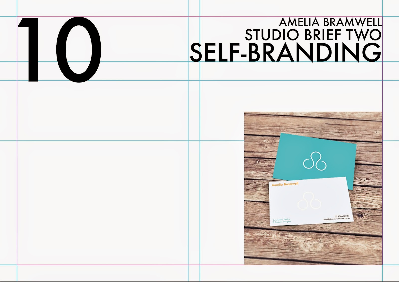
OUGD402 CV Design (Studio Brief Two)
As I am hoping to stay in Leeds over summer, I decided that I would also design a CV to hand out to places around leeds. I designed this, which actually managed to get me a job at the o2 academy.

OUGD402 Drew Millward 'Dust' Opening (Studio Brief One)
I went to 'Dust' opening by Drew Millward at Colours May Vary. All of his prints were screen printed and they were incredibly intricate and really interesting to look at. I would quite like to screen print my logo, however I won't have the time. I think I might try doing this over summer. It would also be interesting to make some prints over summer that I could maybe sell, or even prints that could advertise me as a designer.


OUGD402 Print Methods (Studio Brief Two)
For my business cards, I have decided that I would like them printed onto quite thick, off-white stock. I have chosen this, as I plan to emboss my logo onto the card, and therefore it would have to be quite thick to look effective. I have chosen to print it onto off-white stock, as I would preferrably go for white, however white cards generally will get dirty very quickly, especially when stuck in someones old wallet.
OUGD402 Presentation Grid (Studio Brief Two)
I decided to use the same presentation board that I use for my design boards, as I think it's very legible and it's also quite a modern style. This is what the design boards look like. As presentations don't generally involve paragraphs of type, I edited out this part of the grid.


Below is what my grid looks like, and an example of the grid with content in it.
OUGD402 Website Development (Studio Brief Two)
I then decided that I would create a website flat. I decided to create one for the gallery page, as I feel that showcasing previous work is probably the most effective way to get more work. I looked through my old projects and came up with this design. I decided that the bottom bar of the webpage should involve social media links, as my presence is very apparant on social media and I am constantly tweeting and uploading new photographs. I felt that as a graphic designer, you have to live and breathe design, so therefore my tweets and uploads would be very relevant. I would also have a blog on my website that I would be linked with my tumblr that I also use to showcase my design work.

OUGD402 Further Logo Development (Studio Brief Two)
After peoples comments in the crit, I decided I would try to develop the logo design further even though personally I really liked it. I started by trying to add a tail to the a and the b and joining it up. I don't think this is very successful as it looks slightly like a face or a dog.


I then tried to seperate the letters. I don't think this is successful either, as it looks like someone wearing really odd glasses.
I then tried to seperate the circles further and push the top circle down. I didn't think this was successful as it stopped looking like an 'a' and a 'b'.
I then got rid of the top circle entirely and added two straight lines. I quite like this logo design, however still not as much as the original.
I thought this was probably the most successful design that I had come up with after the previous logo, so I put them both on a document and asked the facebook group which people preferred. Everyone commented saying that they still preferred the first design.
For this reason, I tried to play around with it a bit more to try to stop it looking slightly dirty, however I didn't think it was as successful, so I decided that I would stick to the original logo design.
OUGD402 Presentation & Feedback (Studio Brief Two)
I then created this presentation showcasing all of the work that I have done for PPP so far. I then presented this to the whole class, in which they gave me feedback.


I got a lot of useful feedback from my tutors and peers. They said that they thought that my colour scheme was very successful and relevant for me as a person. Many people said that they really liked my logo, however some people said that it sort of looked a little bit dirty. Personally, I don't think it does but I am going to try create a logo similar, however different, and see which people prefer.
OUGD402 Business Card Design (Studio Brief Two)
As I think I am quite a simple person, I want my business cards to reflect that. I want them to represent me, so I want them to emphasise the fact that I'm an approachable, happy, friendly person. I feel like my logo definitely echoes that already, as it has loose circles in it, which emphasises the fact that I am an open person. This is also echoed in the breaks in the circle.
My business card is going to be in the colour scheme that I have chosen previously, so all I really have to play around with is the layout and style of all of these attributes. I want my business card to be very simplistic, yet stand out.
I have designed this front using simply the logo and the colour scheme. I am unsure which colour I prefer, however I could actually use both and alternate between handing them both out - after all many people have multiple different business cards with their designs on. I would like the logo to be debossed so that it shows through on the back of the business card. I think it would be an interesting element to the card, especially if it was in really thick, off white stock.
I am now going to design a back for the business card. I also want the back of the card to be simplistic, as I believe this will make it very legible.
Firstly I came up with this idea, however after some thought, decided it definitely didn't need another logo on the back, especially when the logo from the front would be embossed on it already. It would be far too busy.
I then came up with this idea, which I think is a lot more effective. I put the logo on in white to show where the embossing would be, and then worked around that. I think it's a lot more successful and I'm really happy with the outcome.
I then made some mock-ups of what the businesscard would look like once it had been printed.
I also made a mock up of the back design that I didn't particularly think would be successful, and this confirmed that I prefered the embossed design.
OUGD402 Business Card Research (Studio Brief One)

I really like the way that these business cards are printed on coloured card and therefore the colour is visible from the side of the business cards. It's also effective that the tops of the business cards are white, as it makes it more interesting to look at and more legible.

I think this business card design is nice, however it's very messy in my opinion and very illustration based, which isn't relevant for the style that I want to go for for my own cards.

I like the design of these business cards as they have rounded edges, which I think is quite quirky and matches the typeface used for the logo. I also think that the colour scheme is really nice.

The sides of these business cards are all spray painted a colour. I think this would be really interesting to do with my own business cards, and I have researched into this and apparently it's quite easy to do yourself - all you need is a clamp and spraypaint. Although I don't have the time to do this, I think it would be interesting to do it over summer when I have more time to experiment.

I think these business card designs are incredible, however they are not relevant to me exactly. It would be really cool if I could get these made but with my own business card design (not like a credit card), just because they wouldn't be as disposable as normal business cards are and they would also fit perfectly into a wallet.

I love the fact that part of the letters are debossed and I think it would be really interesting for my own business cards to have the same effect. However, obviously, the design would be embossed on the other side, so I would have to take this into account when designing the back of the card with all of the information.
Subscribe to:
Posts (Atom)