Tuesday 28 February 2017

OUGD602 DBA - Photographs (Brief Two)

Below are the photographs that myself and Izzie took and edited of our final products. I think the photographs and packaging as a whole turned out really well and definitely get our concepts across.


Monday 20 February 2017

OUGD602 DBA - Packaging Concept & Development (Brief Two)

We have researched further into personality traits and realised that there are four different personality traits. These are analyst, sentinel, explorer and diplomat. To develop our concept further we decided that we should assign a specific style of design that fits with each of these personalities. These are as follows;

Diplomat - post-modern
Analyst - avantgard
Sentinel - modern
Explorer - kitsch

As there are four of us in the group, this means that we can design one each.

Amelia - Diplomat - Post-modern
Izzie - Analyst - Avantgard
Sentinel - Modern - Taime
Explorer - Kitsch - Florence

I decided that I wanted to try to create the post-modern packaging, as I rarely design in a post-modern style and therefore it might look really interesting in my portfolio, and show that I can design in multiple different ways and styles - I'm not sure if this will be beneficial or not, I will have to find out when we do portfolio surgery. 

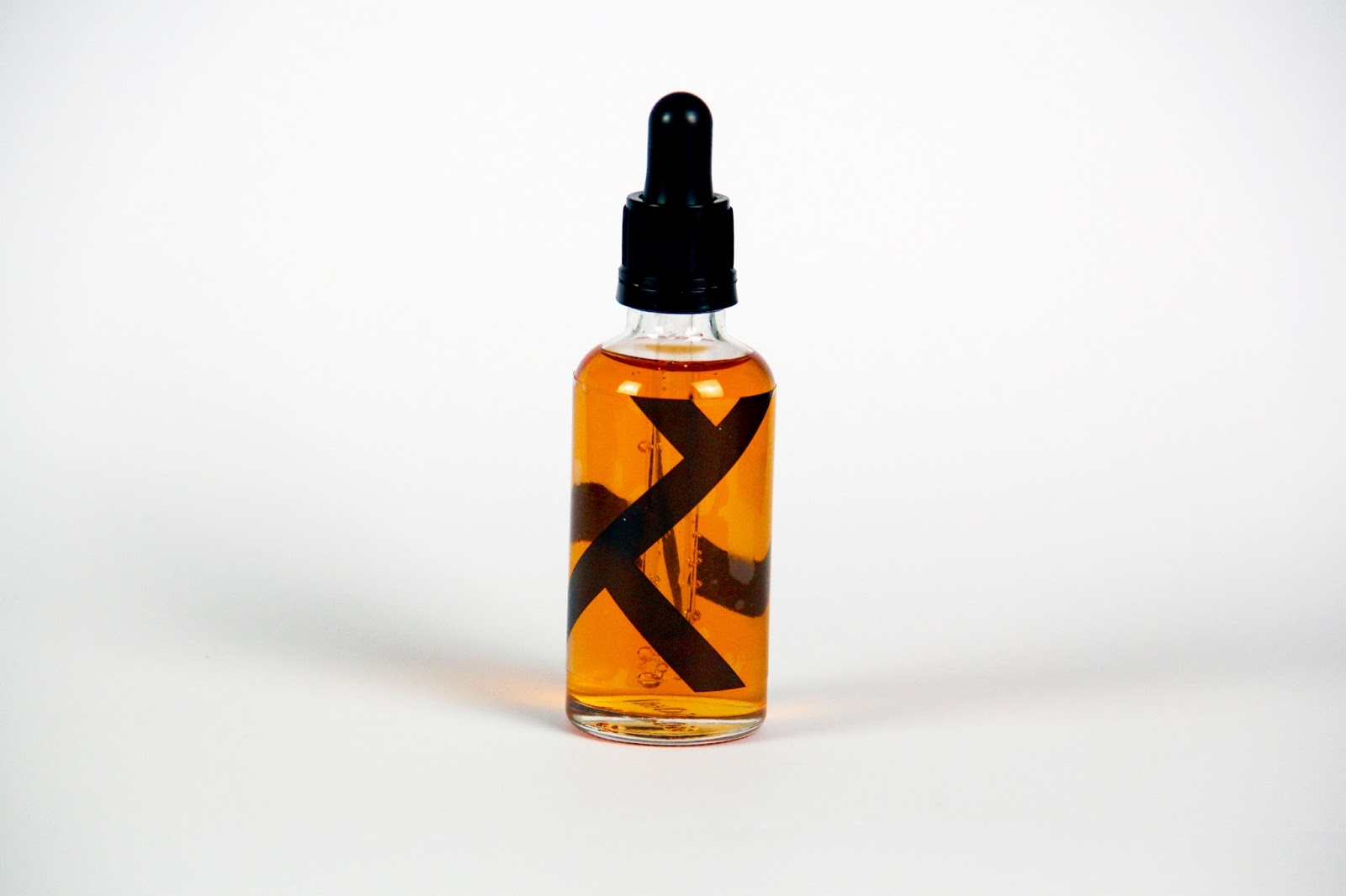
Below are the designs that I came up with. 

Firstly, I started by using the colour scheme we have previously discussed. This particular design was trying to get a postmodern style across by using a lot of different shapes and illustrations. I think it's quite effective, however the colour scheme doesn't really work for it. It might work a lot better in just black and white, however I will discuss with the group once I have experimented some more.


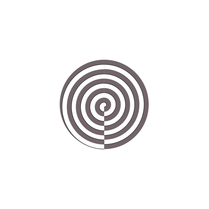
I then tried a similar style, however this time using patterns instead of just random shapes. This works a lot better than the previous, however I worry that it's not really getting across the post-modern style that I was going for, as it's very neat and organised. 


I then tried using triangles to create some depth to the design. I think this works really well and is definitely post-modern, however I'm not so sure it will fit very well with everyone elses designs - we will have to discuss when we all get together to review.


I chose the post-modern personality because I wanted to push myself to design different styles, I decided I would try to use different mediums as well. This was created using both illustrator and photoshop. I think it's a lot more post-modern than all of the previous designs, however I don't think it really fits with the brand that we have created.


I then tried again, as I had seen some of the other groups designs and thought this might work using different shapes. I think it does work very well, however it is definitely a modern design and no longer post-modern.


I also tried to use the patterns from the previous design and create packaging full of patterns, however it looks far too organised - similar to the previous design, it still looks very modern.


I then tried to experiment and create patterns using the logo design. These weren't very successful and relied heavily on colour.


Finally, I created shapes using an Illustrator brush I had found online and tried to create a type of lino-cut style. This was probably the most successful design so far, so I thought I would wait to get some feedback from the rest of my group before carrying on.


Having shared my designs with the rest of my group and seen all of their designs, we all came to the conclusion that it would probably be best if the actual design was created in black and white. I think this made the project a lot easier, and I had the idea of showing all the different personality types by creating faces with continuous line drawings. I started by creating these in illustrator, and then I played with the spacing and the fill of each shape created. I thought these were really successful, however could be improved. 


I then decided to take to pen and paper and create the continuous line illustrations this way. I then scanned these illustrations in and live traced them in illustrator. I think this design was a lot more successful and showed it to my group.


My group agreed and said it was very successful, however suggested that I space the faces further apart. Below is the final design. I think it's really successful as it's definitely post-modern and really gets across the concept of my design - to showcase the different personality types within being a Diplomat.


Sunday 19 February 2017

OUGD602 DBA - Brand Guidelines (Brief Two)

Our brand guidelines for Personalis are as follows:

Colour scheme:


Typefaces:

Gill Sans Regular
Gill Sans Bold

Saturday 18 February 2017

OUGD602 DBA - Bottles & Reasoning (Brief Two)

Having discussed previously that we would like our product to be in liquid form, I decided it would be useful to look into possible packaging for our product. Below is the bottle that I chose and bought for the project. I chose this bottle as it is better than taking a shot or drinking a can - these are often thought of as unhealthy and full of chemicals, such as energy drinks. Instead, I have previously used a medicine that comes in a bottle similar to the below, so I thought it would be the most appropriate. The idea being that a few drops would be placed on the tongue using the dropper in the morning. This also makes the product a lot more hygienic, as the bottle would never touch the mouth of another person.


Friday 17 February 2017

OUGD602 DBA - Logo Development (Brief Two)

Myself and Izzie decided that we would try to create a logo for our brand. Prior to this, as a group we discussed possible names. These are as follows:

- Focus
- Enhance
- Explore
- Illuminate
- Personality
- Personalitate
- Personalis

We all settled on personalis - personalis is latin for personality, which we thought was appropriate because the concept for our product would be to enhance your own personality, not change it. Therefore, personalis is relevant as both are going back to routes - personalis, the word and the customer, their own personality base.

Based on this, me and Izzie started mocking up potential logo designs. We wanted the logo design to be quite rounded, as it would make the brand less harsh and seem a lot less chemical-y. The logo designs below was created with the concept of the different layers of peoples personality. This was unsuccessful as they wouldn't rescale and therefore wouldn't make a very good logo design.


The next logo designs were based on a similar concept, and tried to show the layers within a personality. These were also both unsuccessful as they just don't look very aesthetically appealing, and having discussed with the group are not what we really had in mind.


Florence suggested that she would like to see a circular head as the logo design. I thought I would try this out, however I wasn't really set on the idea as it would look very gendered and this was something we originally discussed we were trying to avoid. I tried this possible logo design within type as well - I'm not a huge fan and none of the rest of the group were.


I then started looking at the route of the word, and the way it is pronounced. These type responses are below. I think they're quite aesthetically pleasing, however we discussed as a group that these logos would probably put possible customers off as they're very scientific-looking and aren't readable. 


I then looked at using the accents that appear on the original latin word, and tried to add a possible face as Florence had suggested.


Taime pointed out straight away that it reminded him of the amazon logo - something I hadn't made the connection of myself. 


Below are Izzie's responses. She also tried to experiment using a face as the logo design. As previously stated, we didn't like this idea as a group as a whole as they look very gendered.


Then Izzie suggested that we focus on liquid, as we had previously discussed that our product should be in liquid form, as we have previously seen drugs that come in a liquid form and they're a lot more appealing than taking a pill every morning. This was the logo design that she came up with. It was really successful and we all agreed that this should be our logo design as it really gets across the approachable and natural feel of the product that we are aiming for.


I then created the logo design using the grid below, to make it a lot neater and focus purely on circles. 


Thursday 16 February 2017

OUGD602 .PDF Portfolio (Brief One)

Along with my online portfolio, I thought it would be useful to have a .PDF portfolio that I can send when applying from jobs along with a creative CV. This will be really useful as the job I am applying for will be able to get an idea of what kind of work I enjoy creating and my style of design. The portfolio is below. I decided to keep it quite minimal, however every page will have my logo design and contact information on. The layouts of the images are generally different on a lot of the pages, however it's still apparently that each page is part of the same portfolio due to the grid used to create it.

The grid is below: