Myself and Izzie decided that we would try to create a logo for our brand. Prior to this, as a group we discussed possible names. These are as follows:
- Focus
- Enhance
- Explore
- Illuminate
- Personality
- Personalitate
- Personalis
We all settled on personalis - personalis is latin for personality, which we thought was appropriate because the concept for our product would be to enhance your own personality, not change it. Therefore, personalis is relevant as both are going back to routes - personalis, the word and the customer, their own personality base.
Based on this, me and Izzie started mocking up potential logo designs. We wanted the logo design to be quite rounded, as it would make the brand less harsh and seem a lot less chemical-y. The logo designs below was created with the concept of the different layers of peoples personality. This was unsuccessful as they wouldn't rescale and therefore wouldn't make a very good logo design.


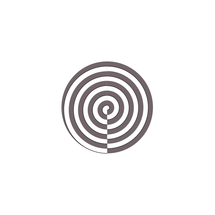

The next logo designs were based on a similar concept, and tried to show the layers within a personality. These were also both unsuccessful as they just don't look very aesthetically appealing, and having discussed with the group are not what we really had in mind.


Florence suggested that she would like to see a circular head as the logo design. I thought I would try this out, however I wasn't really set on the idea as it would look very gendered and this was something we originally discussed we were trying to avoid. I tried this possible logo design within type as well - I'm not a huge fan and none of the rest of the group were.


I then started looking at the route of the word, and the way it is pronounced. These type responses are below. I think they're quite aesthetically pleasing, however we discussed as a group that these logos would probably put possible customers off as they're very scientific-looking and aren't readable.


I then looked at using the accents that appear on the original latin word, and tried to add a possible face as Florence had suggested.


Taime pointed out straight away that it reminded him of the amazon logo - something I hadn't made the connection of myself.

Below are Izzie's responses. She also tried to experiment using a face as the logo design. As previously stated, we didn't like this idea as a group as a whole as they look very gendered.

Then Izzie suggested that we focus on liquid, as we had previously discussed that our product should be in liquid form, as we have previously seen drugs that come in a liquid form and they're a lot more appealing than taking a pill every morning. This was the logo design that she came up with. It was really successful and we all agreed that this should be our logo design as it really gets across the approachable and natural feel of the product that we are aiming for.

I then created the logo design using the grid below, to make it a lot neater and focus purely on circles.


No comments:
Post a Comment