This is the final presentation that I have designed for Design Strategy. It features most of the work that I have completed this year for PPP and some other work that I am proud of for other projects. In the script, I discuss what my growing interests are within graphic design, and also projects that I am proud to have been a part of over the last year. This can all be seen below:
Slide 1: Logo.
Slide 2: First Year Portfolio.
This is some of my portfolio of work from my first year at LCA that I am particularly proud of.
Slide 3: Design Knowledge.
Before coming onto this course, my idea of graphic design was limited to mainly branding, posters, leaflets and website design, as those were the main things I was taught at A-level and in Art Foundation. In first year, I learnt a lot of other design work also counts as graphic design, such as publication design and typeface design. Through-out first year, I found out I really enjoyed publication design, and it was something that I really wanted to push in second year. I also had a very limited knowledge about different printing techniques. Once I had learnt these skills, I set myself a goal for second year to experiment with them further, even if the set brief didn’t require it.
Slide 4: Second Year Portfolio.
This is some of my second year portfolio to date that I am proud of.
Slide 5: Progress.
This year, I feel as though I have definitely progressed within my designs and also my final outcomes. I have tried to make each piece of work that I create as relevant to the task as possible, but also tried to experiment with different print techniques other than digital print. I have also tried to experiment with stock, for example the Type in Context publication was printed on GF Smith Colour plan, and then it was also screen printed over to give a gloss effect, not only on the front cover, but also on the images inside the publication.
Slide 6: Growing Interests.
During first year, I generally made all of my final outcomes using the computer. This year, however, I have tried to push myself with physically creating work. I have really got into paper cutting and creating stop motions. I have also had a try at using letterpress and mono printing. My opinion on digital design has definitely changed since last year, as I originally thought physical design was quite tedious, however I have come to have an admiration for it as I really prefer the final product of something created or printed by hand.
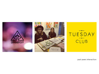
Slide 7: Past Years Interaction.
This year, I have really tried to interact more with the Leeds Art Scene. Myself and Izzie had followed a band for a while called CryBabyCry. We had been to multiple of their gigs and decided we wanted to be a part of their music. We emailed them asking if it would be possible to come to one of their gigs and create a music video, to which they agreed. It was a really great experience, as I have a growing interest in film and video, and this particular task was really challenging as it was quite a professional one to jump into.
Another thing I have done this year was take part in the Leeds Christmas Market and Munro House. I heard about the market taking place a month prior and contacted the owner asking if it would be possible for myself, Izzie and Florence to have our own stall. It was a really great experience as it was a very busy environment and a lot of people took my business card. It was also successful as I have expanded my contacts, as not only did I meet the owner of Munro House, I also met the lady who runs a lot of print fairs around Leeds, which will be a very useful contact to have in the future, as I plan on staying in Leeds after university.
Finally, myself and Izzie were asked by two designers in Hull to become part of their new art studio entitled ‘Tuesday Club’. The studio consists of a film maker, photographer and graphic designer. Although we are yet to take on any work, it’s a really good opportunity as it will give me the chance to meet other designers and also get my own name out into the creative industry. We plan to start taking on work over summer, which will be great for my portfolio, seen as Hull has a really good growing art scene.
Slide 8: Exhibition Visits.
Over the year, I have been to see multiple exhibitions in Leeds. The first I visited was an exhibition entitled ‘inFLUX’ which was part of the third years graphic art and design course at Leeds Beckett. It was an interesting exhibition as all of the artwork was varied and different with no common theme. The next exhibition that I visited was Joan Cornella. I had been following this illustrator online for over a year and it was really great to see his work in the flesh. It was an odd exhibition to visit as most exhibitions expect silence while walking around, however this has people laughing. The final exhibition featured on this slide was the second year Illustration students, which was an exhibition based on prints. All of the artwork featured was really great and different from one another.
Slide 9: Design Studios.
Through-out second year, I have come across multiple different design studios as part of PPP. Some of these are seen on the slide. The first is Alphabet, which is a design studio based in Leeds. I particularly like this studios portfolio as it has varied responses to each brief that they have been set. Instruct is another studio that I found over the year. It’s a design studio that is based in Manchester, and they have worked with many big names, such as Adidas and the BBC. Finally, I found out about a studio called Studio DBD, which is also based in Manchester. This is one of the studios that I have been in contact with for the creative report.
Slide 10: Online Presence / Networking.
This year I have tried to create an online presence for myself. I have created a twitter and tumblr for my designs, and I have also recently joined LinkedIn. I hope by doing this and keeping each running will potentially get me future clients, or at least contacts already in the creative industry.
Slide 11: Personal Identity.
My personal logo design last year was the first logo design on this slide. I have since tried to alter the logo design, and I have come up with the logo design on the right. My logo design is based upon a circle, which symbolises focus.
Slide 12: Self Promotion.
For my self promotion, I have created my own website that I plan to actually create fully in summer. I have also re-designed my business cards and created a letterhead and envelope. Over summer, I plan to carry on asking people if I can interview them, as I found the responses I got for my creative report really helpful and interesting.
Slide 13: Future Projections.
Over the summer and in third year, I plan to email some of the studios I have been in contact with for my creative report and ask if it would be possible to get some work experience with them. I also plan to carry on experimenting with different print methods and pushing my own design to relate to said printing methods and techniques. It would also be a great experience to get involved with Tuesday Club, and also some more print fairs around Leeds. For this, I will need to have prints already printed, so over summer it would be a good idea to design some and print them to a high standard.
Slide 14: Thank you.


No comments:
Post a Comment