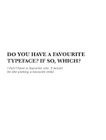
This is the final publication design that I have come up with. I think it's really successful as it fits with the concept, as each double page spread is completely different. I stuck to two colours as it would make printing the publication a lot easier. The main colour I needed, however, was black, as in my interview, Dave said that he doesn't have a favourite colour, however 'there is something to be said about the colour black'.


No comments:
Post a Comment