Showing posts with label DBA. Show all posts

Sunday, 14 May 2017

OUGD602 Module Evaluation (Brief One & Two)

The past year has been a very important experience for myself as it has made me realise crucial elements that are key for my own design process. The most important thing I have learnt is that it is absolutely integral to create a concept to develop my work. I realised this as I found I was a lot more passionate about the work I was producing when it had been informed by a body of research. I also learnt the importance of blogging my ideas, as it made final resolutions a lot easier to understand as I had a step by step guide of my idea generation; I found this really useful for group critiques and talking through my work at studio visits, and I therefore believe that it will be incredibly useful in industry when explaining my work, both at interviews and when I have a job to work colleagues. 

I feel a lot more confident when talking through the ideas behind my work this year, I believe this is down to my engagement with the industry through studio visits. The studios that I sent my work were very complimentary and said I have a wide set of design skills which they look for in their employees. 

My presentation skills have improved vastly this year and I believe that this is also due to my engagement with industry, in particular my internship with Foxduo Design. I discovered that there isn’t anything to be nervous about when sharing ideas with clients; the worst that can happen is they don’t like the design - this isn’t the end of the world.

I think my biggest weakness this year was time management. I left contacting studios till late due to the fact I wanted to get my personal branding and online presence perfect before contacting them, and I feel as though this could’ve jeopardised my opportunity of getting internships due to the studios being fully booked for the year. 

This year I have learnt that I really enjoy collaborating, whether that be with other designers or other specialisms. I think it has a really beneficial impact on my portfolio as it shows I can work as part of a team, but I also believe the outcomes are a lot stronger when more than one person has worked on the brief - two heads are better than one. 


Overall, I have really engaged with university this year and I definitely feel in a better position and feel more industry ready than I was at the beginning of the year.  

Tuesday, 14 March 2017

OUGD602 DBA - Feedback & Reflection (Brief Two)

Today we presented our products to DBA. Overall, it was a really nerve-wrecking yet exciting task. They generally really liked our product that we had created and said that it was very different from everything they had seen already and that it was interesting to see the product in liquid form and how it could work.

The one bit of negative feedback we did get was that the logo design doesn't really fit well on the packaging, and that it might've been more successful to leave it off entirely, as it wasn't really needed. I agree with this to an extent, however I still think the products need a brand logo to make it recognisable when online.

Although we didn't win this particular project, it was really beneficial as I now have an idea of what it's like to present a project to a client and the way the whole thing works.

Sunday, 12 March 2017

OUGD602 DBA Evaluation (Brief Two)

This brief was a live brief set by DBA, for which we had to get into groups and create a brand for a nootropics drug of our choice. I worked with Izzie, Florence and Taime, which worked out really successfully as we all bounced ideas off each other and I believe we came up with a very original, conceptual design.

The idea behind our nootropic drug was to aim it at a huge target audience, as we had identified from research that most other nootropic drugs are aimed at studying. From research, we came across the fact that there are four personality types, and they all relate closely to different art styles in their nature. We decided to base our nootropic drug on this, as this gave us a huge target audience and each of us creative freedom; we created a packaging design each, each completely different, however kept the use of colour a constant. Our outcome was really successful; it was very different from anything any of the other groups produced.

I really enjoyed working on this project with my group, as I believe the project wouldn’t have been as successful if we had worked on it individually; it just goes to show that two (or four) heads are better than one. This project will look really great in my portfolio as it is a live brief, which shows I am capable of working to deadlines, concept-development and presenting to clients. 

Presenting to DBA was a really different experience as it was a lot more nerve-wrecking than presenting to my course as there was a lot more pressure, however I feel I actually spoke a lot clearer in this environment, due to the fact I knew I would be getting some feedback for the work my group and myself had produced. 


Time management was key for this project as we all had to make sure that everyone was pulling their weight and getting their packaging designs completed for a specific date for printing the products. I think the fact that it was a live brief contributed to our time management as we needed to have the project completely finished for a specific date, which added a lot of pressure to get things done. 

Friday, 10 March 2017

OUGD602 DBA - Presentation (Brief Two)


The Script.


IZZIE: Slide 1: Intro
AMELIA: Slide 2: "Not long ago doctors were the only ones driving prescription decisions. But now, patients are better informed and more empowered, causing a shift in the way pharma thinks about branding their medications. No longer do companies just need to speak to a drug’s efficiency, they also need to resonate with consumers, build trust, and most importantly be easily recognised."
IZZIE: Slide 3: Concept
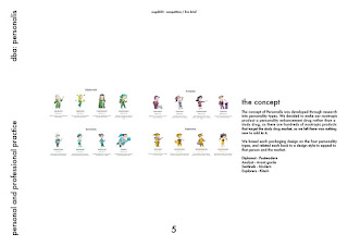
TAIME: Slide 4: The general population can be divided into 4 ‘base’ personality types. Analysts, Diplomats, Sentinels and Explorers.
TAIME: Slide 5: Each personality type has defining characteristics that affect their personal preference regarding aesthetic appeal. Our concept is to appeal to each personality type individually within one brand. Identifying links between personality traits and design style to ensure a broad range of target audiences.
IZZIE: Slide 6: Personality types
IZZIE: Slide 7: Design with personality types
AMELIA: Slide 8: Example. Sentinels are fact-minded individuals, excelling administrators and unsurpassed at management. They have an appreciation for accuracy and perfection. For this reason, modernism is a well informed design style that would most appeal to people of this personality type.
IZZIE: Slide 9: Not just a study drug.
IZZIE: Slide 10: Further enhancing the concept.
AMELIA: Slide 11: The brand will advertise/gain visibility through the online personality quiz. At the end of which the user will be directed to the Personalis product best tailored to them as an individual.
IZZIE: Slide 12: Website
IZZIE: Slide 13: Logo design
AMELIA: Slide 14: The colour scheme is a balance between corporate professionalism and energetic positivity.IZZIE: Slide 15: Final design treatments
IZZIE: Slide 16: Analyst packaging design
AMELIA: Slide 17: This is the packaging design for Diplomat. It’s in a postmodern style to emphasise the traits of a Diplomat; creative, eager and inspiring. It’s hand rendered and shows the range of people that fit within this personality base.
TAIME: Slide 18: The packaging for the Sentinel personality is in a modernist style which reiterates the fact that sentinels are practical and fact minded.
AMELIA: Slide 19: This is the packaging design for Explorer, it’s in a kitsch style to get across the erratic nature and boldness of this personality base.

Tuesday, 28 February 2017

OUGD602 DBA - Photographs (Brief Two)

Below are the photographs that myself and Izzie took and edited of our final products. I think the photographs and packaging as a whole turned out really well and definitely get our concepts across.


Monday, 20 February 2017

OUGD602 DBA - Packaging Concept & Development (Brief Two)

We have researched further into personality traits and realised that there are four different personality traits. These are analyst, sentinel, explorer and diplomat. To develop our concept further we decided that we should assign a specific style of design that fits with each of these personalities. These are as follows;

Diplomat - post-modern
Analyst - avantgard
Sentinel - modern
Explorer - kitsch

As there are four of us in the group, this means that we can design one each.

Amelia - Diplomat - Post-modern
Izzie - Analyst - Avantgard
Sentinel - Modern - Taime
Explorer - Kitsch - Florence

I decided that I wanted to try to create the post-modern packaging, as I rarely design in a post-modern style and therefore it might look really interesting in my portfolio, and show that I can design in multiple different ways and styles - I'm not sure if this will be beneficial or not, I will have to find out when we do portfolio surgery. 

Below are the designs that I came up with. 

Firstly, I started by using the colour scheme we have previously discussed. This particular design was trying to get a postmodern style across by using a lot of different shapes and illustrations. I think it's quite effective, however the colour scheme doesn't really work for it. It might work a lot better in just black and white, however I will discuss with the group once I have experimented some more.


I then tried a similar style, however this time using patterns instead of just random shapes. This works a lot better than the previous, however I worry that it's not really getting across the post-modern style that I was going for, as it's very neat and organised. 


I then tried using triangles to create some depth to the design. I think this works really well and is definitely post-modern, however I'm not so sure it will fit very well with everyone elses designs - we will have to discuss when we all get together to review.


I chose the post-modern personality because I wanted to push myself to design different styles, I decided I would try to use different mediums as well. This was created using both illustrator and photoshop. I think it's a lot more post-modern than all of the previous designs, however I don't think it really fits with the brand that we have created.


I then tried again, as I had seen some of the other groups designs and thought this might work using different shapes. I think it does work very well, however it is definitely a modern design and no longer post-modern.


I also tried to use the patterns from the previous design and create packaging full of patterns, however it looks far too organised - similar to the previous design, it still looks very modern.


I then tried to experiment and create patterns using the logo design. These weren't very successful and relied heavily on colour.


Finally, I created shapes using an Illustrator brush I had found online and tried to create a type of lino-cut style. This was probably the most successful design so far, so I thought I would wait to get some feedback from the rest of my group before carrying on.


Having shared my designs with the rest of my group and seen all of their designs, we all came to the conclusion that it would probably be best if the actual design was created in black and white. I think this made the project a lot easier, and I had the idea of showing all the different personality types by creating faces with continuous line drawings. I started by creating these in illustrator, and then I played with the spacing and the fill of each shape created. I thought these were really successful, however could be improved. 


I then decided to take to pen and paper and create the continuous line illustrations this way. I then scanned these illustrations in and live traced them in illustrator. I think this design was a lot more successful and showed it to my group.


My group agreed and said it was very successful, however suggested that I space the faces further apart. Below is the final design. I think it's really successful as it's definitely post-modern and really gets across the concept of my design - to showcase the different personality types within being a Diplomat.